The Challenge
Branding
Logo Design
Vector art Illustration
Merchandise Dev.
Marketing
![]()

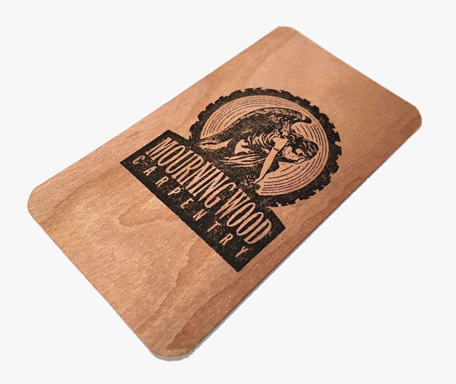
We sourced six species of wooden business cards from a company called Cards of Wood and selected several metallic inks to apply the rubber stamps by hand on the various wooden card hues. The natural wood material and handmade feel of their custom-crafted calling cards added another level of sophistication to the brand image, whose business is all about woodworking and detailed craftsmanship.


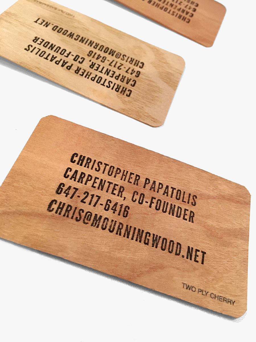
We had the cards machine-printed in subsequent runs to ensure readability and avoid waste we found problematic during the handmade process. The revised printing process produced consistent crispness, as shown below.

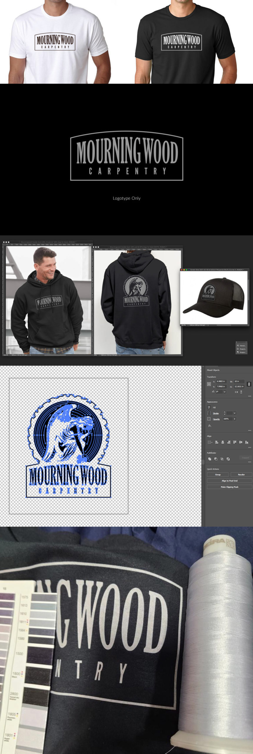
The logo was created in Adobe Illustrator as a single color vector file. For single color applications on darker garments, I needed to create a second version of the logo where the ink only prints the artwork’s highlights. The outer holding rule completes the effect to match the artwork’s positive version, as shown on the dark garments below.

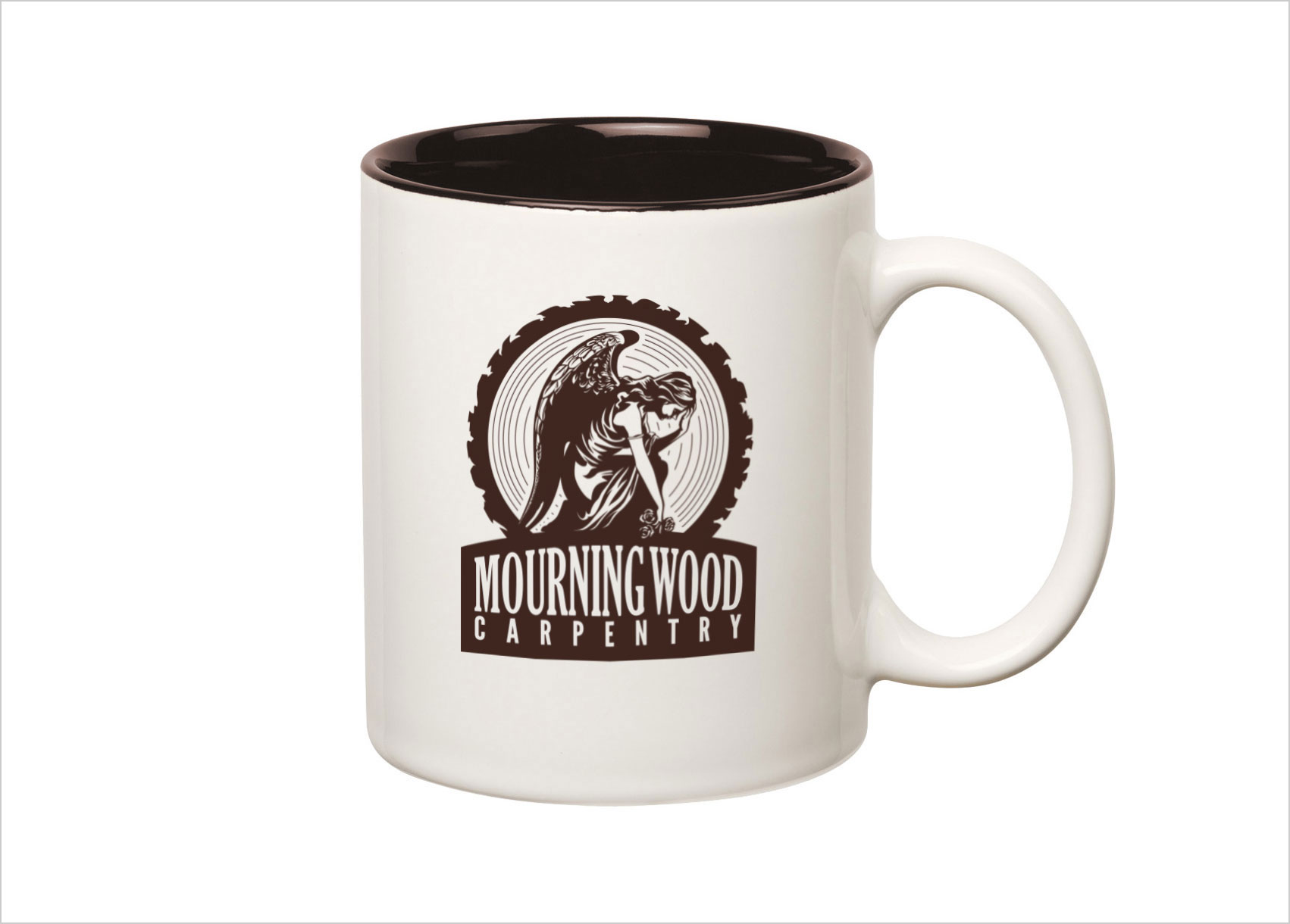
When designing the merchandise, we decided to create a simplified version of the logo for use on the front of the garments. The logotype-only version of the mark turned out to be a solid stand-alone alternate brand mark. The logotype-only version also works as a solution for smaller use cases where the more intricate full logo is too complex.

Need Help with Branding and Bringing Your Idea to Life?
Let’s Connect
