


The Challenge
Kannalif and Factory Interactive approached me to help shape the packaging and visual identity for a new CBD brand entering a highly competitive market.
Working from an existing logotype and a five-part product structure—WAKE, REVIVE, BOOST, RELAX, and SLEEP—the challenge was to create a bold, elegant, and flexible visual system that could differentiate the formulations while giving the brand a distinctive shelf presence.
Services Provided:
Branding
Creative Direction
Packaging Design
Brand Design System
The Icons
Kannalif organized its initial product line into five “Time of Day” categories: WAKE, REVIVE, BOOST, RELAX, and SLEEP.
A distinct icon was developed for each category to help customers quickly understand the intended role of each formulation and create a recognizable navigation system across the brand.




The Brand Colours
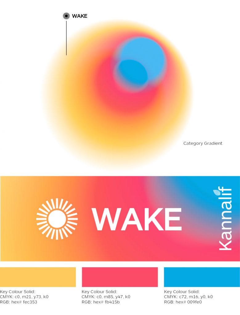
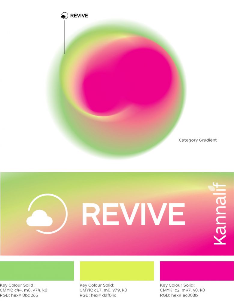
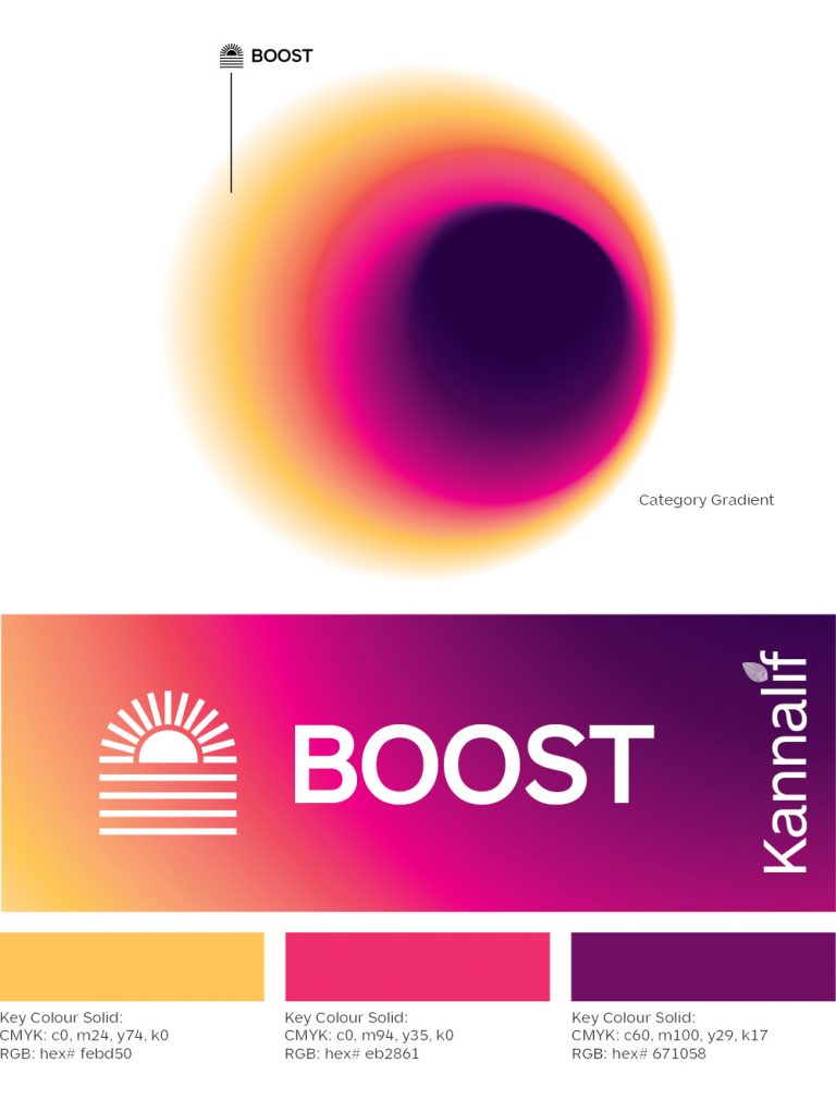
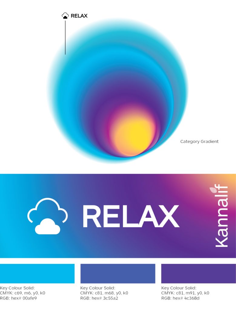
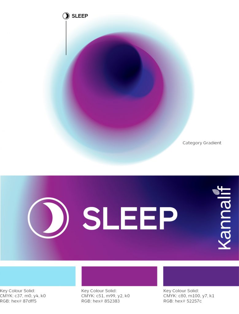
A bold gradient color system was developed to distinguish the five product categories while giving Kannalif a vibrant, recognizable visual identity.
Each color expression works with the icon system to help differentiate formulations and create consistency across packaging and digital touchpoints.
The Packaging
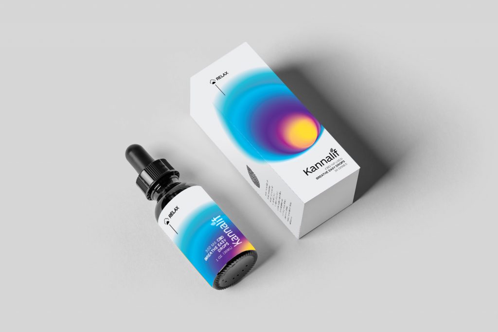
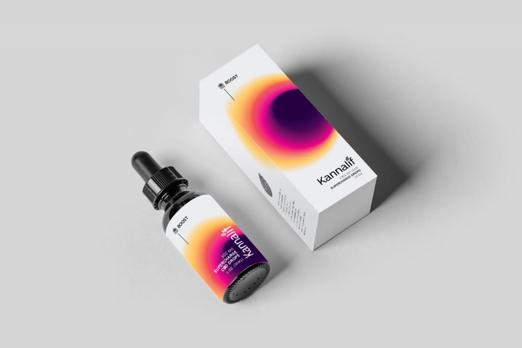
The packaging system was developed alongside the MVP eCommerce launch, extending the new visual identity across labels, boxes, and product formats.
Through iterative refinement with the client, the designs balanced brand expression, regulatory requirements, and production needs.
The initial work culminated in the launch of Kannalif’s MVP eCommerce experience and the brand’s debut at its first industry trade show.
